plot
- class snippets.plot.Point(x, y)
Point in two dimensions.
- x
Horizontal coordinate.
- y
Vertical coordinate.
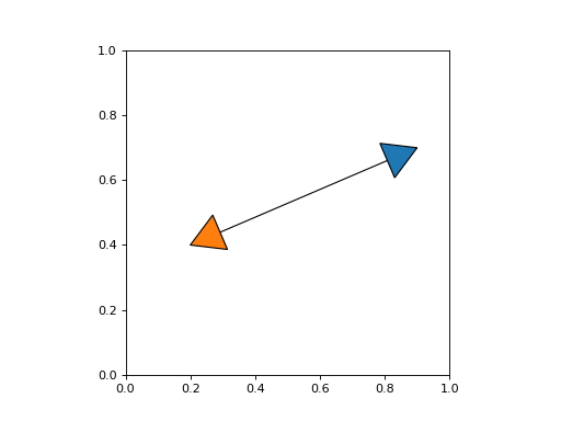
- snippets.plot.arrow_path(path: Path, length: float, width: float | None = None, backward: bool = False) Path
Create an arrow at the end of a path.
- Parameters:
path – Path to create an arrow for.
length – Length of the arrow.
width – Width of the arrow (defaults to an equilateral triangle).
backward – Create an arrow at the start of the path.
- Returns:
Path representing an arrow.
Example
from matplotlib.patches import PathPatch
from matplotlib.path import Path
from matplotlib import pyplot as plt
from snippets.plot import arrow_path

fig, ax = plt.subplots()
path = Path([(0.2, 0.4), (0.9, 0.7)], [Path.MOVETO, Path.LINETO])
ax.add_patch(PathPatch(path, fc="none"))

arrow = arrow_path(path, 0.1)
ax.add_patch(PathPatch(arrow))
arrow = arrow_path(path, 0.1, backward=True)
ax.add_patch(PathPatch(arrow, fc="C1"))
ax.set_aspect("equal")
(
Source code,png,hires.png,pdf)
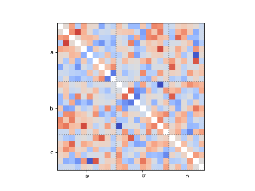
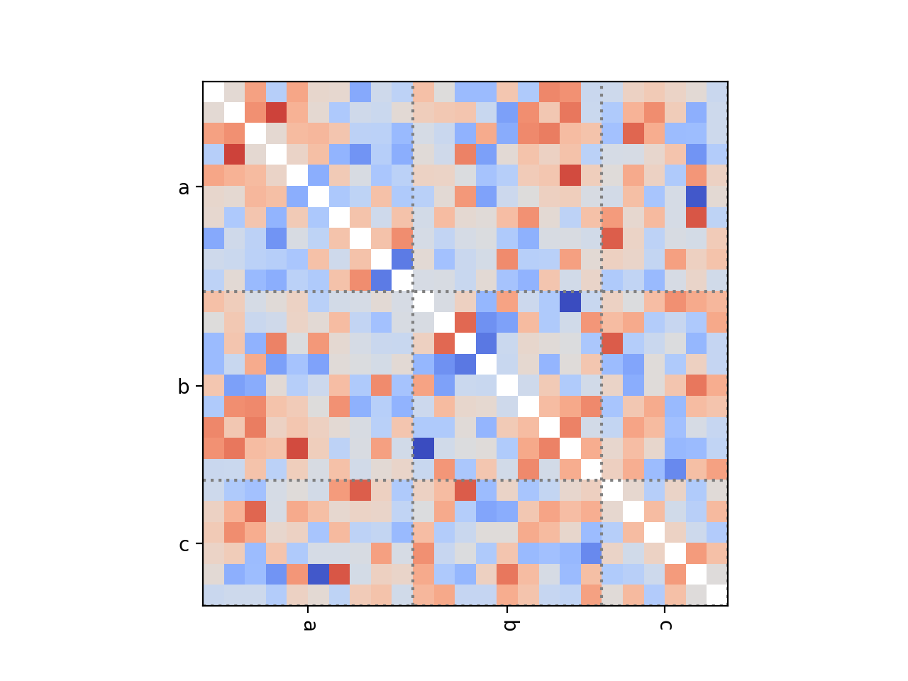
- snippets.plot.dependence_heatmap(samples: Dict[str, ndarray], method: Literal['corrcoef', 'nmi'] = 'corrcoef', ax: Axes | None = None, labels: bool = True, lines: bool = True, xlabel_rotation: float = -90, ylabel_rotation: float = 0, **kwargs) AxesImage
Show the dependence between parameters as a heatmap.
- Parameters:
fit – Named parameter samples.
method – Method to estimate dependence between variables.
ax – Axes to use for plotting.
labels – Show parameter labels.
lines – Show lines between blocks of parameters.
xlabel_rotation – Rotation of x-axis labels for parameter names.
ylabel_rotation – Rotation of y-axis labels for parameter names.
**kwargs – Keyword arguments passed to
Axes.imshow.
Example
import numpy as np
from snippets.plot import dependence_heatmap

# Draw some correlated samples.
n = 25
cov = np.cov(np.random.normal(0, 1, (n, 100)))
samples = np.random.multivariate_normal(np.zeros(n), cov, 100)
samples = {
    "a": samples[:, :10],
    "b": samples[:, 10:19],
    "c": samples[:, 19:],
}

# Show the dependence.
fig, ax = plt.subplots()
dependence_heatmap(samples)
(
Source code,png,hires.png,pdf)
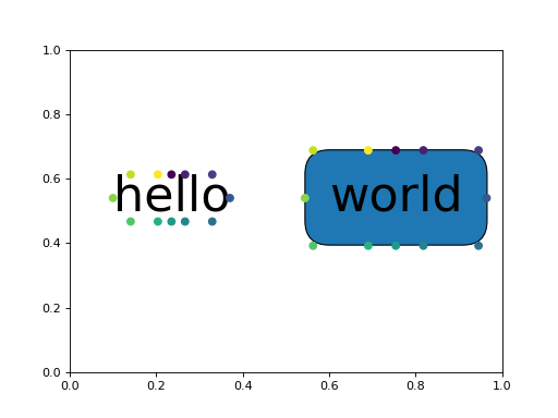
- snippets.plot.get_anchor(artist: Artist | Text, hour: float) Point
Get an anchor on the boundary of an artist at the given “hour”.
- Parameters:
artist – Artist on whose boundary to get an anchor. If a
Textinstance and it has a bounding box patch, the bounding box patch is used.hour – Direction of the anchor as the hour on a 12-hour clock.
- Returns:
Location of the anchor.
Note
matplotlib.Figure.draw_without_rendering()may need to be called for extents of artists to be calculated correctly.Example
from matplotlib import pyplot as plt
import numpy as np
from snippets.plot import get_anchor

# Add some text to the plot.
fig, ax = plt.subplots()
texts = [
    ax.text(0.1, 0.5, "hello", fontsize=40),
    ax.text(
        0.6, 0.5, "world", fontsize=40, bbox={"boxstyle": "round,pad=0.5"}
    ),
]
ax.set_xlim(0, 1)
ax.set_ylim(0, 1)

# Draw without rendering ensures the extent of all artists is computed.
fig.draw_without_rendering()

# Find the anchors at different positions and plot them.
hours = np.arange(12)
for text in texts:
    anchors = [get_anchor(text, hour) for hour in hours]
    ax.scatter(*np.transpose(anchors), c=hours, zorder=9)
(
Source code,png,hires.png,pdf)
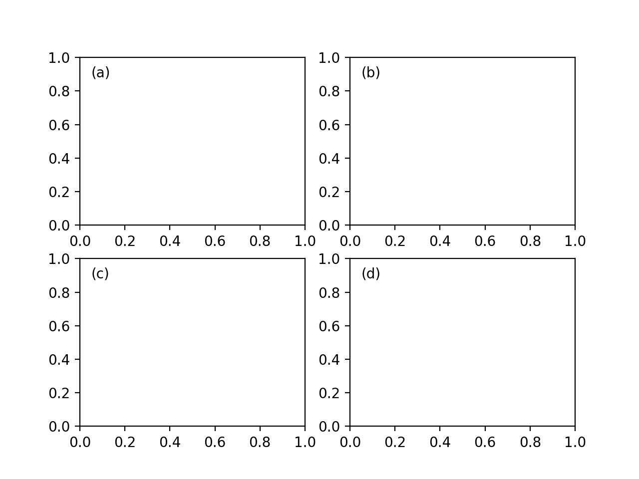
- snippets.plot.label_axes(axes: Iterable[Axes] | Axes, labels: Iterable[str] | str | None = None, loc: str = 'top left', offset: float = 0.05, label_offset: int = 0, **kwargs) List[Text]
Add labels to axes.
- Parameters:
axes – Iterable of matplotlib axes.
labels – Iterable of labels (defaults to lowercase letters in parentheses).
loc – Location of the label as a string (defaults to top left).
offset – Offset for positioning labels in axes coordinates.
label_offset – Index by which to offset labels.
- Returns:
List of text labels.
Example
from matplotlib import pyplot as plt
from snippets.plot import label_axes

fig, axes = plt.subplots(2, 2)
label_axes(axes[0])
label_axes(axes[1], label_offset=2)
(
Source code,png,hires.png,pdf)
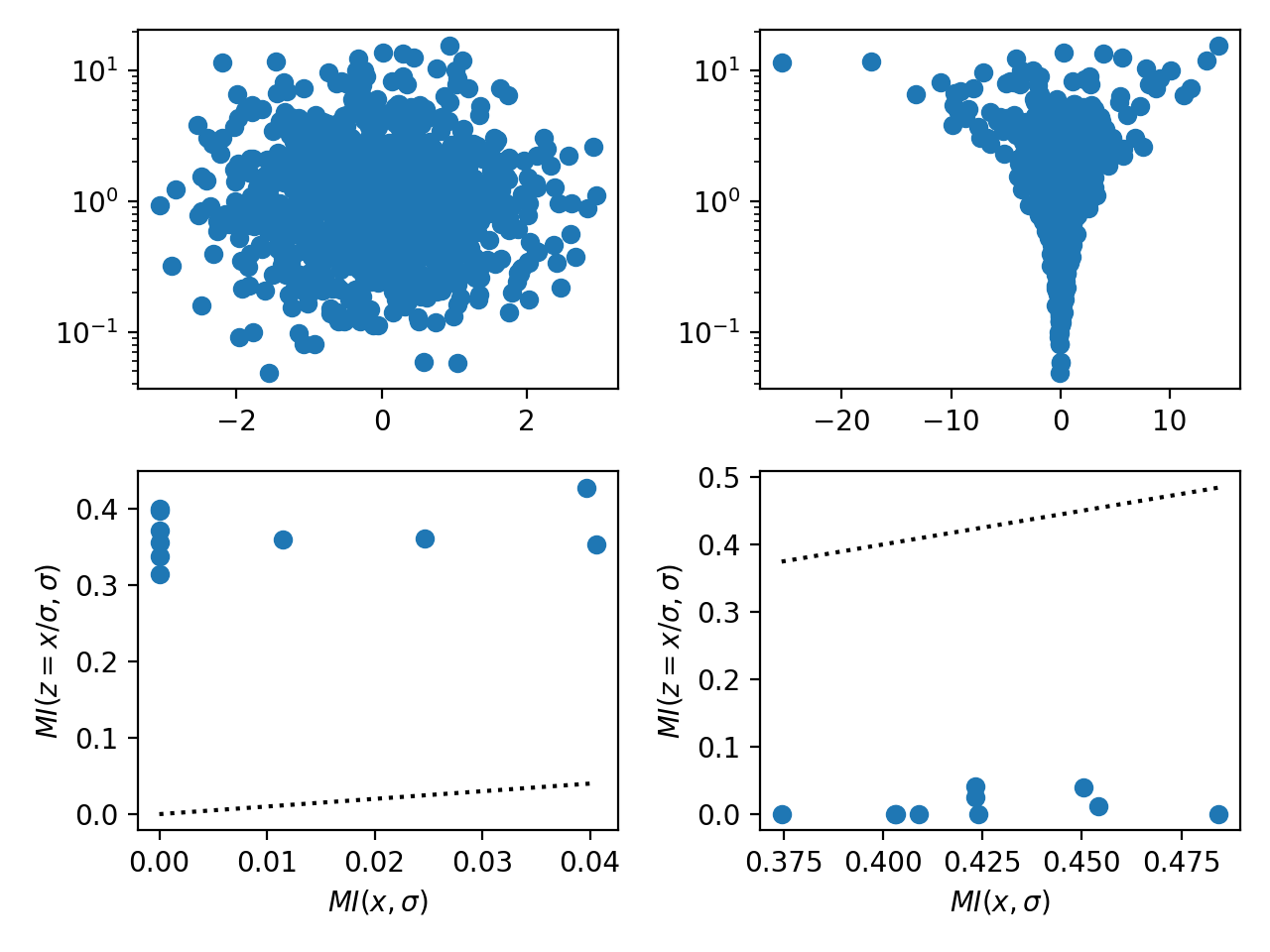
- snippets.plot.parameterization_mutual_info(x: ndarray, scale: ndarray, ax: Axes | None = None, labels: bool = True, **kwargs) Tuple[ndarray, ndarray, PathCollection]
Scatter plot of the mutual information between scale and location parameters for centered and non-centered parameterizations.
- Parameters:
x – Centered parameter of interest.
scale – Scale parameter of the prior on
x.ax – Axes to use for plotting.
labels – Add axis labels.
**kwargs – Keyword arguments passed to
Axes.scatter.
- Returns:
Tuple of mutual information between scale and centered parameter, mutual information between scale and non-centered parameter, and points.
Notes
Standard centered parameterizations in hierarchical models often exhibit “funnels” if the data do not strongly inform each parameter individually (see here for details). Choosing between the centered and non-centered parameterizations is often challenging without inspecting scatter plots between parameters and the scale parameter of the corresponding prior. This function estimates the mutual information between the scale \(\sigma\) of the prior and both the centered parameterization \(x \sim \mathsf{Normal}\left(0, \sigma^2\right)\) and the non-centered parameterization \(x = \sigma z\) with \(z \sim \mathsf{Normal}\left(0, 1\right)\). The parameterization with the lower mutual information is generally preferable because it decouples the parameters under the posterior.
Example
from matplotlib import pyplot as plt
import numpy as np
from snippets.plot import parameterization_mutual_info


fig, axes = plt.subplots(2, 2)

n = 1000
p = 10
scale = np.exp(np.random.normal(0, 1, n))

# Example parameters dominated by the data, i.e., `x` is independent of
# `scale`.
x1 = np.random.normal(0, 1, (n, p))
# Example parameters dominated by the prior, i.e., `x` is strongly informed
# by `scale`.
x2 = x1 * scale[:, None]

# Scatter the mutual information, lower is better.
for (ax1, ax2), x in zip(axes.T, [x1, x2]):
    assert x.shape == (n, p)
    assert scale.shape == (n,)
    ax1.scatter(x[:, 0], scale)
    ax1.set_yscale("log")
    parameterization_mutual_info(x, scale, ax=ax2)
fig.tight_layout()
(
Source code,png,hires.png,pdf)
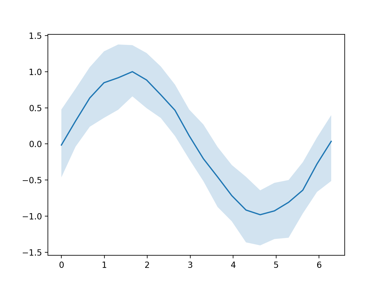
- snippets.plot.plot_band(x: ndarray, ys: ndarray, *, ax: Axes | None = None, ralpha: float = 0.2, lower: float = 0.05, center: float = 0.5, upper: float = 0.95, **kwargs) Tuple[Line2D, PolyCollection]
Plot a central line and shaded band for samples.
- Parameters:
x – \(n\)-vector of horizontal coordinates.
ys – \(m \times n\)-matrix comprising \(m\) samples each at \(n\) horizontal coordinates.
ralpha – Alpha for the shaded band relative to the central line.
lower – Quantile of the lower edge of the shaded band.
center – Quantile of the central line.
upper – Quantile of the upper edge of the shaded band.
ax – Axes to use for plotting (defaults to
matplotlib.pyplot.gca()).**kwargs – Keyword arguments passed to
matplotlib.axes.Axes.plot()for plotting the central line.
Example
import numpy as np
from snippets.plot import plot_band

x = np.linspace(0, 2 * np.pi, 20)
ys = np.sin(x) + np.random.normal(0, .25, (100, x.size))
plot_band(x, ys)
(
Source code,png,hires.png,pdf)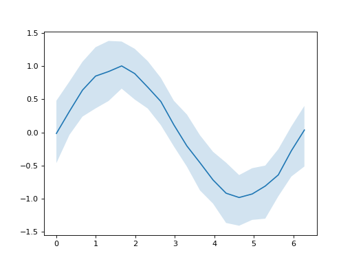
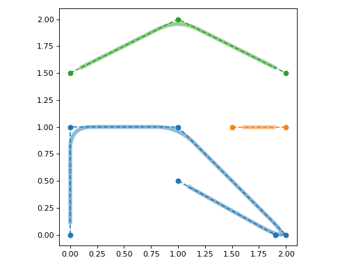
- snippets.plot.rounded_path(vertices: ndarray, radius: float, shrink: float = 0, closed: bool = False, readonly: bool = False) Path
Create a path with rounded corners.
- Parameters:
vertices – Vertices comprising the path.
radius – Radius of rounded corners.
shrink – Amount to shrink the beginning and end of the path by.
closed – Close the path.
readonly – Make the path readonly.
- Returns:
Path with rounded corners.
Example
import matplotlib as mpl
from matplotlib.patches import PathPatch
from matplotlib import pyplot as plt
import numpy as np
from snippets.plot import rounded_path

fig, ax = plt.subplots()
lines = [
    [(0, 0), (0, 1), (1, 1), (2, 0), (1.9, 0), (1, 0.5)],
    [(1.5, 1), (2, 1)],
    [(0, 1.5), (1, 2), (2, 1.5)],
]
for i, line in enumerate(lines):
    color = f"C{i}"
    ax.plot(*np.transpose(line), marker="o", ls="--", color=color)
    path = rounded_path(line, 0.2, 0.1)
    patch = PathPatch(path, lw=5, fc="none", ec=color, alpha=0.5)
    ax.add_patch(patch)
ax.set_aspect("equal")
fig.tight_layout()
(
Source code,png,hires.png,pdf)